MAIN MENU
Redefining the menu and categories of Ladenzeile
MAIN MENU
Overview
Ladenzeile's mission was to be a go-to-marketplace for fashion, living, and lifestyle. Over the years their product categories increased exponentially. The menu became insufficient and the design was outdated. I redesigned the menu with a new on brand look and worked with SEO, Content and Marketing teams to restructure the categories.
Objective
Increasing the visibility and discoverability of categories and enhanceing the platform's SEO performance
User Problem
The listed categories are very limited. The users can't find the right category they were looking for.
Business Problem
Ladenzeile's catalog grew over the years and the legacy menu wasn't able to handle the categories. Additionally, opportunities for promotions, seasonal content, and monetization were missed.
Solution
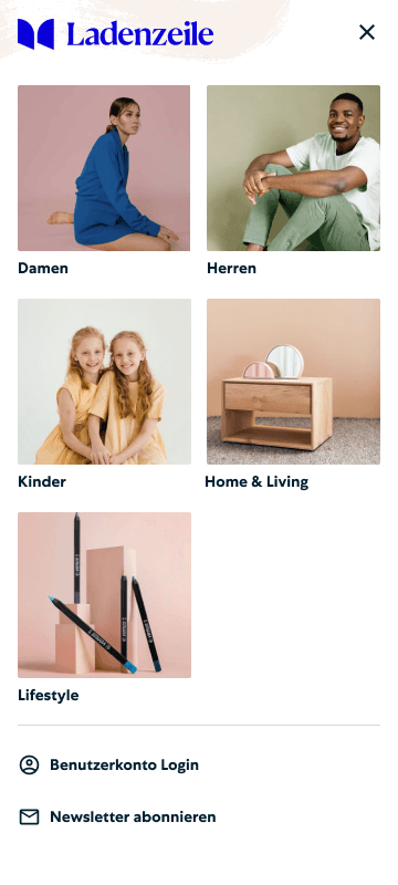
A restructured intuitive menu with more categories listed, new on brand look, "Unsere Lieblinstucke" section to promote campaigns and themes, and a new section for SEO focused keywords
Impact
The main menu redesign, featuring links to high-search-volume categories, enhanced SEO and discoverability, resulting increase in organic traffic, click-through rates, and conversions.
THE problem space
Old Menu Design and Structure
User research revealed that the previous menu lacked several key top-level categories and essential subcategories, making navigation difficult. Competitors offered more comprehensive navigation with a modern look.
The desktop has a very limited space to show all the the top level categories. A new approach was needed to have a consistent experience on mobile and desktop.
UNDERSTAND AND DEFINE
Design Thinking Workshop
To understand and define the problem collaboratively, stakeholders from QM Team, responsible from the information architecture, SEO Team, responsible from the navigation links, Marketing, responsible from promotional content, were participated in the workshop.
1st Part
Done by SEO PM
Introduction, Main Menu Status Quo, Defining Risks And Metrics, Goal Setting Exercise , Lightning Demo
Goal Statement
Smart and automated main menu will help users in their journey by providing navigation to relevant, seasonal, and inspirational content that can be also monetised.
Success Metrics
Click-through rate (CTR) on menu items
Keyword rankings, Crawl depth and indexation
Clicks on featured content/promos

2nd Part
Done by Me
HMW Questions, Brainstorming and Affinity Mapping for Persona Needs & Business Needs, Category Mapping Workshop
How Might We
Enhance the platform's search engine optimization (SEO) to improve visibility and ranking in search engine results.
Increase the discoverability of products and content, leading to higher engagement and conversion rates.
Persona Needs
We brainstormed the section needs of the mainstreamer, harmonizer, trendsetter, and performer personas regarding relevant, inspirational, and monetized content.
Business Needs
We brainstormed the business needs, focusing on requirements, wishes, needs, and limitations.
solution
Redefined Main Menu
design
Mobile Prototype
validation
Testing the New Menu
I conducted two separate unmoderated tests targeting different categories using UsabilityHub. Each test consisted of two tasks, followed by questions on rating the experience, task difficulty, overall impressions, and suggestions for improvement.
Tasks to Accomplish
Test I: Finding dresses under damen, mode, finding lipstick under lifestyle, kosmetik
Test II: Finding TV mobel under wohnen, furniture, yoga mat under lifestyle, sport.
Validate the structure
To test the naming of the Lifestyle top-level category, which has been widely used in the company, and to determine if the category should be included in it. Additionally, to gather user feedback on the "Im Fokus" section, the new highlights section, and the number of displayed categories.
The USER FEEDBACK & iteration
User feedback indicated that “Mode” was old-fashioned and confusing due to its broad scope, renamed to “Bekleidung,”
The confusing “Lifestyle” top level category was renamed to “Weitere Kategorien,” with Beauty moving from Lifestyle to gender-specific categories and "Sport" being separated into its own vertical.
The “Im Fokus” section, found too serious and unclear, was renamed to “Unsere Lieblingstücke”.
Moreover, users stated were too many categories and choices, prompting reductions in the lists. The subcategories should be ordered alphabetically within home, within fashion arranged from head to toe.
responsive design
Desktop Menu
the Result
Learnings and Outcome
After completing the previously mentioned stages of my design process, here is the final outcome:
A Guidiline for Navigation
On Confluence, Main Menu Guideline was created for SEO and Quality Management (QM). This guideline outlines the logic for updating the categories to ensure a user friendly menu and applying same principles for localisation of the menu for different countries.
Increased Clickthrough Rate
We observed a 20% increase in click-through rates and a 8% boost in conversions, indicating better content discoverability.
Succesful SEO Optimisation
By adding links to categories and pages with high search volume on Google, the main menu redesign positively impacted search engine visibility and organic traffic. These new links helped improve SEO, leading to a 8% increase in organic traffic from search engines.


