PRODUCT CARD DESIGN
Transforming the browsing experience of Ladenzeile
COMPANY
Ladenzeile
YEAR
2023
KEY ACTIVITIES
Design Thinking, Prototyping, Unmoderated & Moderated User Research, A/B Testing, Mobile Design

Overview
Ladenzeile is a marketplace that displays its partners' products and directs traffic to the partner's product page. I designed a new product card to transform LZ's browsing experience to make users more engaged and more informed.
Objective
Enhance the UX by providing a new product card design that displays more product information, enabling informed decision-making.
User Problem
Users find product card cluttered which was making it difficult to scan and compare products. Some key information like available sizes and color options were missing.
Business Problem
The partner shops were facing challenges with low conversion rates. Additionally, the outdated product card design needed a redesign to improve user engagement and conversion rates.
Solution
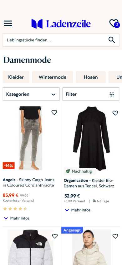
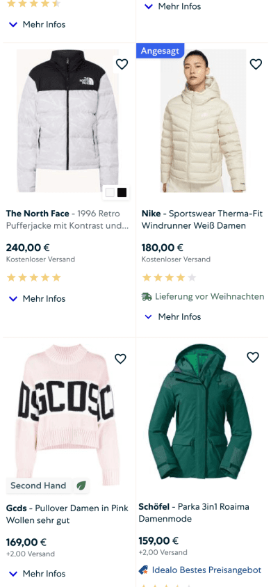
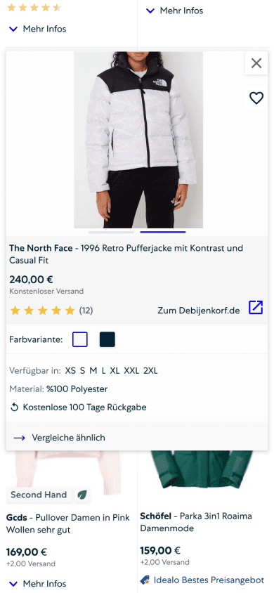
The new product card design with a cleaner and uniform look, along with the addition of a quick view feature, aims to address the problems and enhance the overall user experience.
Impact
The updates to the new product card design led to a significant increase in conversion rates. Additionally, the project generated a new initiative through design thinking activities, which emphasized the value of these activities to the company.
Old Product Card and Page
The product's strategy was to keep users on the product listing page and make a clickout. This improved click-out performance, but decreased the quality of the traffic, as users made more curious, it did not convert at the partner side.
Old Product Card
User research showed that users would like to see more information like sizes, color variants, etc. The product card had usability problems and the picture area got cluttered over time.
Redundant and hidden product page
The product page had the same information as the shop's product page, making it redundant in the user journey and also to the product's purpose.
EMPATHIZE, DEFINE AND IDEATE
Design Thinking Workshops
The series of design thinking activities were selected and adjusted by me to work on a common goal, empathize with the user, and ideate together.
The Methodology and Execution
The two day workshop was in person, utilising Miro for instructions and lightning demo. Multiple P.Os, two product designer, a UX engineer, a UX Researcher, and a growth manager participated.
The Goal
Having a strategy for redesining product card to test and release gradually
Day I Activities
Understand & Define
Introduction, LZ Product Card Status Quo, Preliminary Research & Experiments, Goal Setting Exercise , Lightning Demo, Empathy Mapping, HMW Questions
Day II Activities
Ideate & Design
Recap of Day I , Crazy 8 Sketching, Presentation and Infinite Voting, Solution Sketch (designers only), Presentation, Feedback Round, Next Steps
Goal Setting
How Might We
Crazy 8 Sketching
Worksop
Outcome
User Problem Statement
Users were facing challenges making informed clickouts due to insufficient information and had difficulty to scan products due to the cluttered look.
Business Objective
Enhance user engagement to drive retention and increase conversion rates by optimizing the browsing experience, leading users from exploration to purchase.
How Might We?
HMW - Redesign product card to ease the scannability, increase user engagement, and conversion rates?
HMW - Provide a way to show key product details without hurting browsing experience?
Solution Sketch with UXers


THE SOLUTION SKETCCH
First Concept
After the infinite voting by the stakeholders and presentation. I synthesised the outcome of the workshop and created the first concept with the features:
Brand Title Highlight,
New Label Design,
Color Variations,
Available Sizes,
Delivery Cost,
Fast Delivery Time,
Swiping for Pictures,
No Product Detail Page,
Quick View,
Compare Similar.
USER TESTS
Validate, Iterate, and Refine
We conducted both moderated and unmoderated user testing. Our goal was to simplfy and iterate the concept further.
User Interviews
with the initial concept
Participants (6): Age 25+, German Speaker and Google Shopping User,
Test Script: 4 tasks & follow-up questions; using cognitive walkthrough and think-out-loud.
Goal: Validating the concept, observing behavior, and collecting user feedback for iterating the initial design
User Surveys
with the iterated concept
Participants (40): Age 25+, German Speaker via UsabilityHub
Test Script: 2 rating scale questions, 3 preference tests (initial vs. iterated), 1 prototype task
Goal: Validating the changes, gathering a larger sample, feedback for refining the final design, and decide what to A/B/C test.
The iteration
The first prototype we were not so successful. The balance of signal to noise ratio was not achieved, Users found the quick view convinient, but more improvement was needed. The level of information is good but the information on the overview and extended view can be more balanced.

More Balanced and Cleaner Product Card Look
After the validation, fonts were more unified and the new accessible color gray was applied to the font. The size info, shop name, and image toggles were removed to reduce the visual load. The product labels became more prominent. The review ranking was added to the card.
More Spacious Quick View
The expanded state looked dense and the size was the same as the product card width. The size was doubled and this gave it a more spacious look. Subsequently, the product picture also slightly increased. The favorite and the close buttons also got bigger to make it more accessible and mobile-friendly.
FINAL DESIGN
Design Breakdown
The final design delivery broke down to three parts; cleaner look to lay out the foundation, more informative to address the user's main pain points, quick view to make users more engaged and provide a unique experience.
RESPONSIVE DESIGN
Desktop Design
IMPLEMENTATION
The Roadmap and A/B Testing
The project was planned to release in three phases with A/B testing to measure and maximize the impact.
Roadmap
The first phase focused on a cleaner look. The second phase, which will be about making it more informative, is dependent on the sync team's progress. The final step, the quick view feature, would be implemented after the tech transformation is complete.
Experimentation
The changes were systemically grouped and ordered to release gradually. For some tests, a C variant was created considering workshop ideation, competitor examples, and user testing.
EXPERIMENT EXAMPLE - BRAND HIGHLIGHT
During the project, we collected different ideas to experiment during the implementation. The C version came from asking how can we push the design idea further.
Hypothesis
Product card do not have the clear hierarchy for users to scan through product lists and find a matching product.
Prediction
By presenting the brand in a clear and prominent way, users could easily scan through the fashion products and make more clickouts.
Metrics
Primary Metric: Conversion rate
Secondary Metric: Bounce Rate, Converting Session Rate
Versions
Results
Variation B: CR +2.35%, CSR: +2.33%, BR: -1.24%
Variation C: CR: +3.74, CSR: +3.43, BR: -2.06
THE RESULT
Outcomes and Learning
On our journey to transform Ladenzeile's browsing experience, here were the findings and outcomes:
Quick View over Product Page
Users preferred quick views rather than the product detail page. They found the feature fast and easy. It provides a smoother browsing experience rather than back and forth.
Experiment Map Created
We built an experiment map (A/B/C testing) to gradually and systematically release new features and measure the impact. The two variants (B/C) are coming from the new concept, further iterations, or user feedback.
Increased Conversation Rate
The improved look changes significantly increased our conversation rate and decreased the bounce rate. The phase 1 was a success!
Launched a new initiative
The compare similar button down below was found useful by most of the participants. Sorting and similarity logics were the key factors in delivering a successful feature. A new project was initiated after our workshops to enhance the product comparison journey.


